Between 6 December and 22 November 2015 there were 2068 failed attempts to login into my machine exposed on the interwebs. I excluded the the ones due to me being unable to type my super-safe password correctly. This equates to about 6 attempts per hour on a machine that is not widely advertised. Presumably, this is mainly due to random attacks that you can also investigate with network telescope, in fact my machine is a network telescope of sorts. So looking at the frequency of usernames used in failed attempts (or attempted break ins if you like) root is the most popular choice and the top 20 are:
| User Name | Count |
| root | 1272 |
| admin | 207 |
| ubnt | 106 |
| user | 69 |
| pi | 64 |
| support | 30 |
| adm | 25 |
| test | 22 |
| zhangyan | 20 |
| dff | 18 |
| guest | 15 |
| reception | 15 |
| a | 9 |
| oracle | 9 |
| from | 7 |
| aaron | 6 |
| ftp | 6 |
| cisco | 5 |
| ftpuser | 5 |
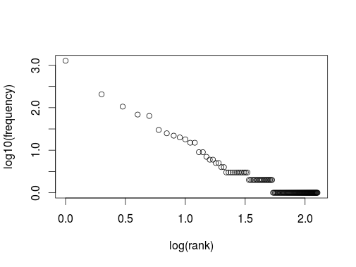
Plotting the rank of a user name against its frequency logarithmically we get the all too familiar picture of a heavy tailed distribution or power law:

However, here the x-axis barely covers 2 decades, so one should be a bit careful to declare that we see a power law with a gradient of about -1.5. Another way to visualise the data is to look at the usernames used in chronological order (excluding repeats) as nodes in a network. Even this very small sample produces a surprisingly complicated graph.

This is a graph produced by the twopi program of graphviz which looked like the prettiest one. The most connected nodes are root and admin. Is this useful? One interesting way approach this question would be to compare this graph and the analysis above with a data set that contains only valid and successful logins. If the data looks suitably diffrent one could use this approach to get alerted to unwanted behaviour. Unfortunately, I do not have access to such a data set.
I was also intrigued to see the user name pi to feature quite high in the charts, ten years ago this would have been less popular.
